
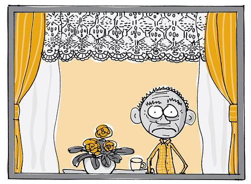
Making illustrations for the book 'De Kanjerklas' was the first time I drew in 2 colors. This may sound simple, but when you're using Photoshop coloring your linework, this is not obvious. It took me days to figure this out. The people at the press couldn't help me, they kept suggesting I would color the arkwork and then change the colormode to 'duotone'. This offcourse would reduce the amount of colors to 2, but would blend everything to a mix of the 2 available colors.
Luckily, De Kanjerklas was designed by someone who knows everything about printing processes and she suggested I'd use Illustrator. At first I didn't like the idea because I was afraid it would make my artwork look too digitally drawn. But playing around with it, I discovered this is actually a very nice way of coloring. First I made the line work in Photoshop. I made all the white transparant and changed the colormode to 'monotone'. Then I imported this in Illustrator and drew the colors in a layer underneath the line work.
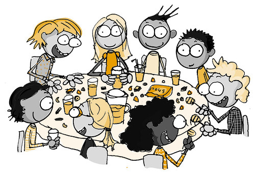
I didn't expect to be using this knowledge any time soon, but just this month I had another request for illustrations in 2 colors.
Geen opmerkingen:
Een reactie posten